
Sculpture

By Concert, Frankfurt, Graphic design, Music

sculpture_reelatrope

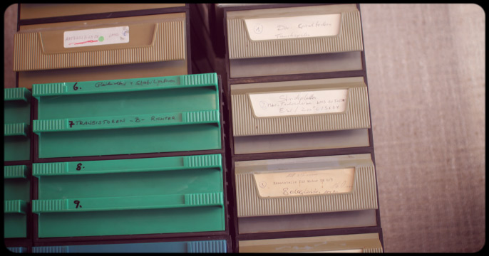
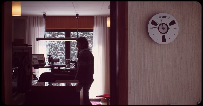
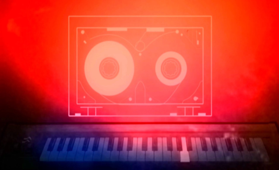
Ok, this entry is considerably overdue: it was during research for the first Desert Dust Cinema film festival in Lobo/Texas (2011) that I first watched the “Demonstration Reel” by Sculpture – an “opto-musical agglomerate”, as they call themselves. Londoners Dan Hayhurst and Reuben Sutherland mix do-it-yourself techno with animated collages, experimenting with psychedelic picture discs, reel to reel tape recorders, samplers, Effectron & Walkman and comic strips – as someone said: “a charmingly surreal and hypnotic cut & paste show”.

A perfect combination of contemporary media, clearly inspired by sounds and visions of the past. These clips show only the tip of the iceberg – go to see the live shows and take a first row seat if Sculpture are around.

In december 2011 Sculpture took their portable laboratory to the saasfee pavillon in Frankfurt, here’s a short clip with live recorded sound that in no way can sum up the flickery, dreamy, chaotic, hypnotical, hyperactive, charming and magic show.

All releases are great, but try to find the 12″ picture vinyls on the Dekorder label with the zoetropic images for having your own little Sculpture show at home (sold out at Dekorder, but try Discogs).

sculpture-lp1

sculpture-lp2

Whole Earth Catalog

By Lost treasures

whole_earth_catalog_01

Some time ago, during a visit to “The Book Stop” in Tucson (AZ) an oversized magazine caught my eye. At first sight, the content seemed to consist of hundreds of totally different elements not related in context, also the visual style was more a collage type of thing rather than the homogeneous graphic style you would expect today. For only $5 for 450 pages (matching the original price of more than 40 years ago) it seemed to be a good deal, although the condition is far from perfect – my copy is pictured above.

The “Whole Earth Catalog – access to tools” has its origins in the Sixties counterculture. In 1966, founder Steward Brand (born 1938) initiated a public campaign and sold button badgets which read “Why haven’t we seen a photograph of the Whole Earth yet?”, because rumours occured that the first ever image of the whole earth had been taken by a NASA satellite, but remained unissued to the public. Lots of the covers of the Whole Earth Catalog show the earth as viewed from outer space.

whole_earth_catalog_02

The WEC was published regularly by Brand between 1968 and 1972, in the years thereafter some more issues and updates followed, but only intermittently. He is cited on the Whole Earth Catalog’s website in an article from the first issue in 1968: “At a time when the New Left was calling for grass-roots political (i.e., referred) power, Whole Earth eschewed politics and pushed grassroots direct power – tools and skills”.

“At a time when New Age hippies were deploring the intellectual world of arid abstractions, Whole Earth pushed science, intellectual endeavor, and new technology as well as old. As a result, when the most empowering tool of the century came along – personal computers (resisted by the New Left and despised by the New Age) – Whole Earth was in the thick of the development from the beginning.”

whole_earth_catalog_03

The WEC can be seen as an evaluation and access device. The items listed in the catalog had to meet the following standards:
.
1. Useful as a tool
2. Relevant to independent education
3. High quality or low cost
4. Not already common knowledge
5. Easily available by mail
.
As the founders/publishers of the Whole Earth Catalog themselves didn’t sell any of the products but listed all items along with vendors and prices, the catalog needed to be updated frequently – 17 issues alone saw the light of day between 1968 and 1971.
The impact of this publication was immense. Also Steve Jobs was aware of the WEC, in his 2005 Stanford University commencement speech he compared the Catalog to an Internet search engine:

“When I was young, there was an amazing publication calles The Whole Earth Catalog, which was one of the bibles of my generation. It was created by a fellow named Steward Brand not far from here in Menlo Park, and he brought it to life with his poetic touch. This was in the late 1960s, before personal computers and desktop publishing, so it was all made with typewriters, scissors, and polaroid cameras. It was sort of like Google in paperback form, 35 years before Google came along: it was idealistic, and overflowing with neat tools and great notions- Steward and his team put out several issues of The Whole Earth Catalog, and then when it had run its course, they put out a final issue. It was the mid-1970s, and I was your age. On the back cover of their final issue was a photograph of an early morning country road, the kind you might find yourself hitchhiking on if you were so adventurous. Beneath it were the words: “Stay Hungry. Stay Foolish.” It was their farewell message as they signed off.”

whole_earth_catalog_04

whole_earth_catalog_05

copyright of all original iamges: Portola Institute, 1971

They have retired – Production stills

By Film, Inhouse production

Everyone who kept an eye on this news section may have noticed that the new inhouse animation “They have retired” had been announced for summer 2013. This intent turned out to be just a bit to optimistic as some small, not so small and also strange work orders took over the timetable. A few more weeks will still be needed to finish this movie.

However, at friday this week all three silkscreen prints that come along with the clip will be produced, and some results will be shown here at the time of the release of our new animation series. In the meantime, here are some production stills so you can be sure that something’s going on in the Playroutine home studios during the last weeks of the year.
Stay tuned.

thr_still_01 thr_still_02 thr_still_03 thr_still_04 thr_still_05 thr_still_06

Karlheinz Dobsky – Lux Lesebogen

By Graphic design, Lost treasures

Published between 1946 and 1964 in post-war Germany, Lux-Lesebogen was a miniature magazine for young people and covered mostly scientific or historical topics. Essential for the success of the encyclopedic magazine (30.000-60.000 were printed bi-weekly) was not only the very affordable price, but also the very modern and unique design by Karlheinz Dobsky.

Especially his ideas for playing around with typography seem to be endless – Dobsky did not use letters already in existence but created all titles by hand, so he could deal with the subject of the magazine in a perfect way. All 410 covers of the Lux-Lesebogen magazine are now published in a book, and on the website for this collection one can examine every single cover of this almost forgotten illustrator.

SST – Studio documentation

By Documentation, Frankfurt, Music

Stepping inside the main rooms of the SST company in Frankfurt feels like a journey through time into the past, as not too much of the 1960s interior has changed since the studio openend its doors in 1969. In this beautiful and comfortable ambience, most recent and long-time proven technology are used together to provide a state-of-the-art vinylcut – the fundamental part of the phonograph disk production process.

For the Playroutine crew, filming this aesthetically very appealing working space was quite a pleasure. At SST, the presence of customers during cutting of teir music on the masterdisc is possible and welcome – if you’re in the Frankfurt area, this is something you don’t want to miss.

They have retired – in production

By Film, Inhouse production

The new animation series “They have retired” is now in full production. After some greenscreen filming of the main protagonist, now the process of keying, 3D modeling and the preparation for the silkscreen prints is in full flow.

Fortunately Bertram Ritter will keep care of the soundtrack again, and hopefully the first clip will be online for you before summer 2013. In between, here are some sort of online postcard flyers for any kind of distribution.

thr_poster_01

thr_poster_02

thr_poster_03

thr_poster_04

thr_poster_05

thr_poster_06

Eyke Volkmer – SF book cover artist

By Graphic design, Lost treasures

Having been a fan of Eyke Volkmer’s graphic work for the German publishing house Wilhelm Goldmann for a long time, it was no big surprise for me that a little online search found the complete cover artwork for the science fiction paperback series “Goldmanns Weltraum Taschenbuecher” in no time.

Through the very precise and lovingly work of Tommi Brem and his Houdine Nation webpage, all SF book covers of turkish born Eyke Volkmer can be watched at the link below, and even better, there’s also a book covering this work.

Volkmer produced 162 covers for Goldmann’s SF series during the 1960s and 70s, and most of the puristic, abstract minimal artwork still has this special modern touch that is so unique to his style. Wilhelm Goldmann himself must have known that he had a very talented man at the right place – it is delivered that he once commented on Volkmer’s work that “It doesn’t look like that in outer space.” At the same time, he encouraged Volkmer to keep on, knewing no one else was doing the same style at all.

weltraumtaschenbuch.de
.
more great sf book covers:
houdinination.de

volkmer_01 volkmer_02 volkmer_03 volkmer_04 volkmer_05 volkmer_06 volkmer_07

All illustrations copyright by Eyke Volkmer,
copyright in the depicted publications: Wilheilm Goldmann Verlag

“It’s a small world” scans

By Film, Inhouse production

Three years ago, our semi-nostalgic clip “It’s a small world” emerged into the light. It wasn’t very long until it was chosen as a Vimeo staff pick, and since then it was watched about 50.000 times, made it to film festivals all over the world and recieved some funny and interesting comments. Beside some filmed footage, all images that were used in this clip were taken from a photoalbum I bought for $5 at the Melrose Trading Post, a very nice weekly fleamarket located in the Miracle Mile district in Los Angeles. If you are around, visiting Canter’s Deli at 419 North Fairfax Avenue is a must – with all the welcoming ambiance combined with the nostalgic charm of the 1950’s decor, it was the perfect surrounding to have a closer look at the bleached out photos in this bargain buy of the day.

Now, for the 3rd birthday of the “small world” clip, here are the original scans of all images in the album – most of them weren’t used, so there’s a good chance for a follow-up at some future day.

And please don’t throw away your old images, send them to the Playroutine home studio instead, OK?

smallworldscan01
smallworldscan02
smallworldscan03
smallworldscan04
smallworldscan05
smallworldscan06
smallworldscan07
smallworldscan08
smallworldscan09
smallworldscan10
smallworldscan11
smallworldscan12
smallworldscan13

The visual world of Alden Volney

By Film, Music

psychodio

While collecting experimental video clips for the first Desert Dust Cinema in Lobo/Texas, I somehow stumbled across the clip “EDVARD GRIEG – Morning mood from ‘Peer Gynt’ Suite No1” by French guy Alden Volney, of which I never had heard before. At first, I had the impression that this was a treasure of a long forgotten past of the early film age, and Alden had just put this found footage on the web.

But as there was more to watch on his Vimeo page, I soon noticed that I was entering the own visual aesthetics of a true original artist. It felt like stepping into a new and strange but somehow also familiar world, filled with the color palettes of the past. Aldens animations in combination with classical music instantly brought the work of Oskar Fischinger to my mind, a perfect transformation of music into a free visual style, not tied to any rules of storytelling.

This work is even more compelling with the background knowledge that the artists’s audiovisual skills are all self-taught, as he states to never even have set a foot in an art school. The fascination of 70s and early 80s aesthetics combined with an oldschool animation style that seems to refuse modern influences – in a good way of course – forms an atmosphere that has its own special magic style.
.
Alden claims that his inspiration comes from the overall atmosphere of a lost age and not particular works of particular artists:

“I suppose that the key element that made me the person I am today is the fact that ever since my life begun, I’ve been exposed to great music and movies that clearly weren’t meant to be watched by a very young boy. When I was a kid, my father used to rent movies pretty much every week at the video store, and he was very interested in genre films, so this is how, by the age of 8 I had already seen stuff like Videodrome, A Nightmare on Elm Street, Midnight Express, Phantom of the Paradise, Akira, 2001: A Space Odyssey, Alien, The Dead Zone etc etc… I think that when your brain is exposed to such works at a time when it’s still going through the process of growing, it has to leave deep traces, I think it explains why, to me, moving images are a powerful tool.”

His video intro clip to the British band ‘Plugs’ was the perfect closing at the end of the Desert Dust Cinema film festival in Lobo/Texas 2011, and the sheer beauty of this warm, abstract and colorful animation in combination with the cool music left the audience totally amazed, to say the least.

Surprisingly Alden Volneys work is almost ignored in France, but in my opinion this status won’t last long. Working mostly abstract for years, he just das written and directed a music video with filmed live action (fortunately using his own colorgrading style). and hopefully more will be published in the near future.

alden_volney